Friday Finance | Virtual Corporate Cards
︎︎︎ About the project:
I had the honor of conducting the UI/UX design efforts for Friday Finance's new segment, Corporate Cards. Throughout this project, I was fully involved in the process of developing a smooth user experience for card issuance, from contributing to ideation sessions to actively designing the entire user experience. Our team was dedicated to crafting a seamless flow that enabled users to issue a card with just three clicks - and I'm delighted to have played a key role in achieving this objective.
I had the honor of conducting the UI/UX design efforts for Friday Finance's new segment, Corporate Cards. Throughout this project, I was fully involved in the process of developing a smooth user experience for card issuance, from contributing to ideation sessions to actively designing the entire user experience. Our team was dedicated to crafting a seamless flow that enabled users to issue a card with just three clicks - and I'm delighted to have played a key role in achieving this objective.
︎︎︎ Product Manager: Javier Bonilla
︎︎︎ Product Designer: Bruna Hirano
︎︎︎ UX Research: Carolina Lima Ribeiro
︎︎︎ The challege: Design the user experience for Corporate Cards
︎︎︎ Segment: Cards
︎︎︎ Tools: Figma, Miro
︎︎︎ Year: 2023
Friday Finance launched Corporate Cards on April and today we have +500 cards issued. Some of the users uses the platform especially because of the Corporate Cards.

︎︎︎ Context
What is Friday Finance?
It is a finance management software that enables startups and SMBs to effectively control their finances through cashflow insights, business accounts, multibanking, corporate cards, and automated accounting.
︎︎︎ Problem statement
Previously, when our users wanted to have Corporate Cards, they had to go to a different software that offered these cards. This meant they had to use multiple services, which complicated their financial management. We had made progress with the Friday Finance Business account, but we still needed to develop the basic features that would enable users to use cards and spend the money they had in their FF Business account.
︎︎︎ Process / Timeline
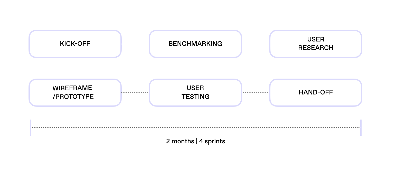
︎︎︎ User Research (The entire User Research was lead by Carolina Lima Ribeiro. I helped with the User Testing)
Research goal:
Solidify Cards value proposition, opportunities and objectives. Test main assumptions identified during the discovery process.
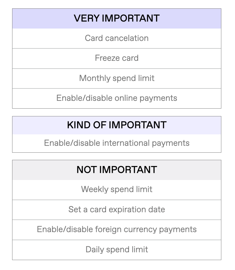
Problems to explore
General usage of company cards: what is the minimum that they expect a card to have? Design: how the experience of using a card and managing it should look like?
Research methods
- In-depth interviews for general questions
- Miro dynamics for prioritizing features
- Prototyping for usability/design
︎︎︎ Key insights
• Digital cards will be sufficient to satisfy the base user need and drive initial adoption, as long we have Apple/Google pay for them to work like a physical one too.
• Companies are creating cards for specific team members, normally one person is responsible for each team.
︎︎︎ Priorization
︎︎︎ Ideation and Design
To better understand our users perspective on Corporate Cards, we conducted a User Research with different UI concepts.
- Card overview on the dashboard
- Card overview in a dedicated page
- Card overview in a dedicated page as a list
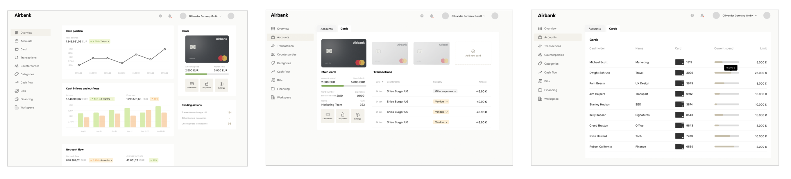
Design 3 was people's favorite because it gives an overview of all cards, with important details of each one of them. Not having to click to see details gives an impression of "saving time".
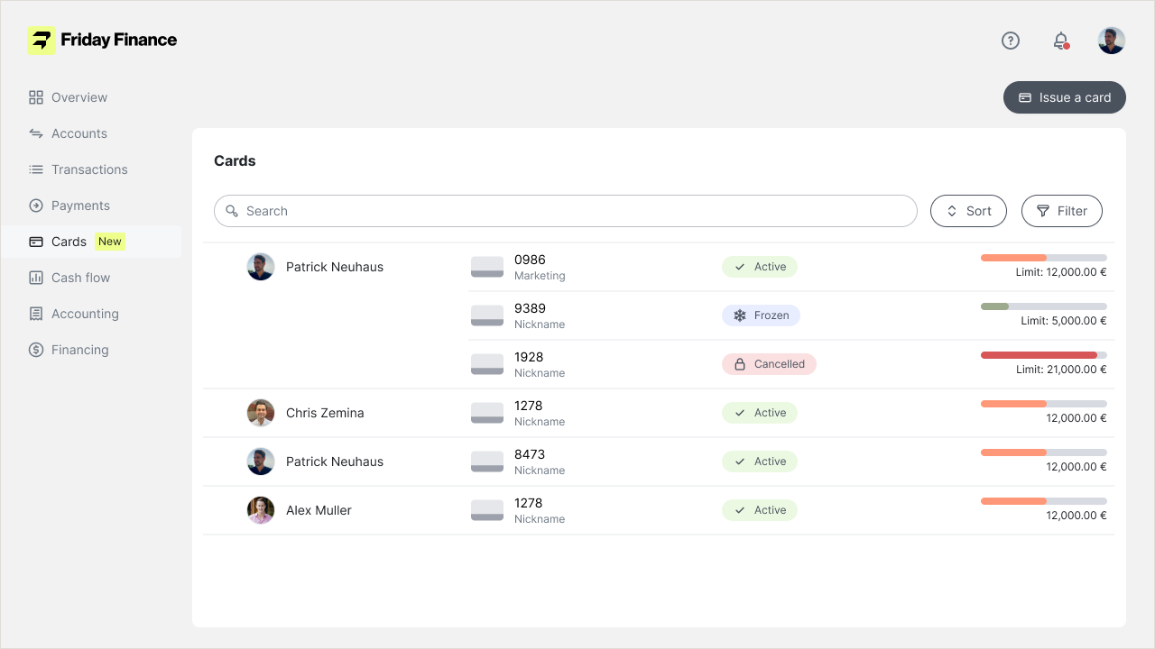
︎︎︎ Ideation and Design | High-fidelity wireframe
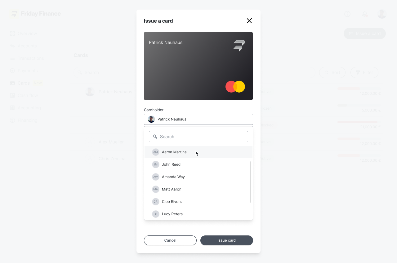
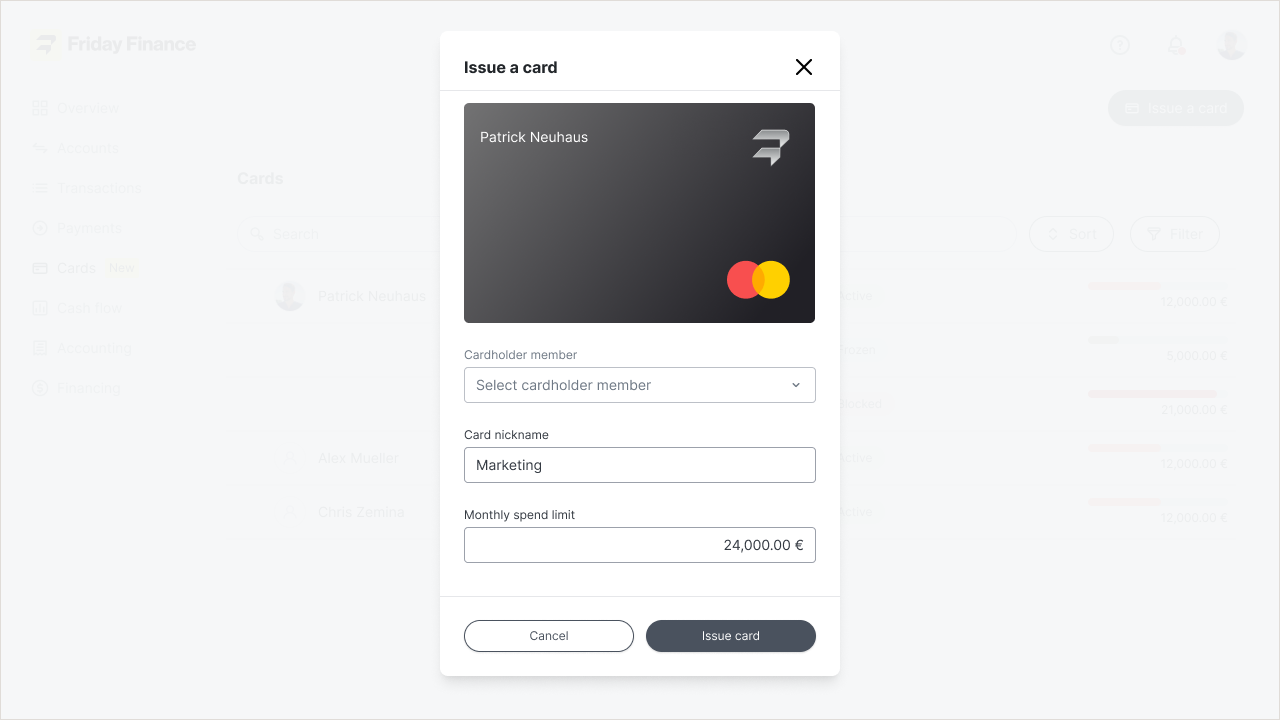
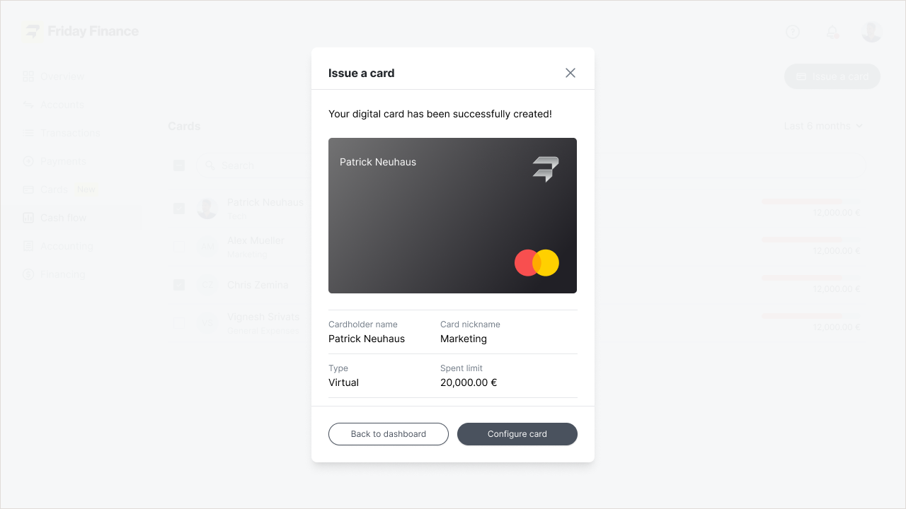
Simplicity was the key word for this project. I created the user flow with a focus on making it easy for the user to issue a card with just three clicks.
I developed new components for the Design System, including the square-button. This button is visually larger and has a bigger clickable area, making it more user-friendly, especially on mobile devices. I designed the overall user experience with the upcoming launch of the native app in mind.


︎︎︎ Metrics
The successful implementation of Corporate Cards resulted in remarkable outcomes. Over 500 Corporate Cards have been issued to date, empowering businesses with improved financial management capabilities. Additionally, the launch of Corporate Cards had a direct impact on the Friday Finance platform, leading to a 25% increase in new user registrations within three months. The interest in our Friday Finance Business account doubled, as more businesses recognized the value of our comprehensive financial solutions.